
How to Choose the Right Paint Color

Selecting paint colors for your home can often be a frustrating process. For a new homeowner especially, it can be hard to know where to begin! While there’s no right or wrong answers here, over the past decade I’ve spent as a residential interior designer, I’ve found a few things to be true.
Your wall color doesn’t have to be the most interesting part of your room. It CAN be if you want, but there are a lot of other ways to bring color into a space!
You will not regret going with the slightly more neutral version of your favorite color. A toned down eggplant will be easier to live with long term than a vivid, crayon-box purple.
You can save yourself a lot of headache by buying a sample pot before committing. Yes, it’s an extra cost but it’s less expensive than having to repaint.
Read on to learn how I’ve always chosen paint colors for my own home and client interior design projects.

Consider the mood or feeling you want to achieve in the space.
First things first, think about the function of your room, what you are using it for, what time of day you’re in it most often, how you want to feel. There is a personal element to this for sure - a color that feels soothing to me might feel boring to you. We each have our own unique perception of color, literally, did you know there’s research that suggests we can only see the colors we can name? I find it helps to write out a list of adjectives to describe the room you’re envisioning and keep those words in the front of your mind as you are looking through color options. Engaging both sides of your brain in the process makes it easier to know it when you see it.
Think about your plans for the room holistically.
In interior design, it’s helpful to think of each element in a room like the cast in a play. There is usually one or two leading actors and a handful of supporting characters. Keeping some elements of the room more quiet will help the key features you want to highlight to shine. Maybe you want to highlight your couch that’s upholstered in a beautiful jewel-toned fabric, or a piece of original art you’ve collected, etc. Sometimes choosing a more subdued wall color is exactly what the overall design plan calls for. Don’t worry about a color being boring, because it will never be viewed on it’s own after you’ve placed all your furniture and decor. It’s one part of a whole ensemble of design elements that make up a beautiful room.

Forget the “rules” you may have heard, go for a color that makes you happy.
White doesn’t always make a space feel brighter - in rooms without a lot of natural light it can actually look a bit dingy. Whereas a mid-tone or dark hue in a dimly lit room can really sing. Did someone tell you yellow is dated? There is for sure a shade of yellow out there that will feel unique and modern in the right space. It’s your home, so if you love it, go for it! I find there’s a lot of gatekeeping in the home design/DIY world online. Nothing bad is going to happen if you break the rules! Don’t let anyone tell you otherwise. Unless they also live with you…but decorating with a partner or family member who doesn’t share your design taste is a whole different blog post!
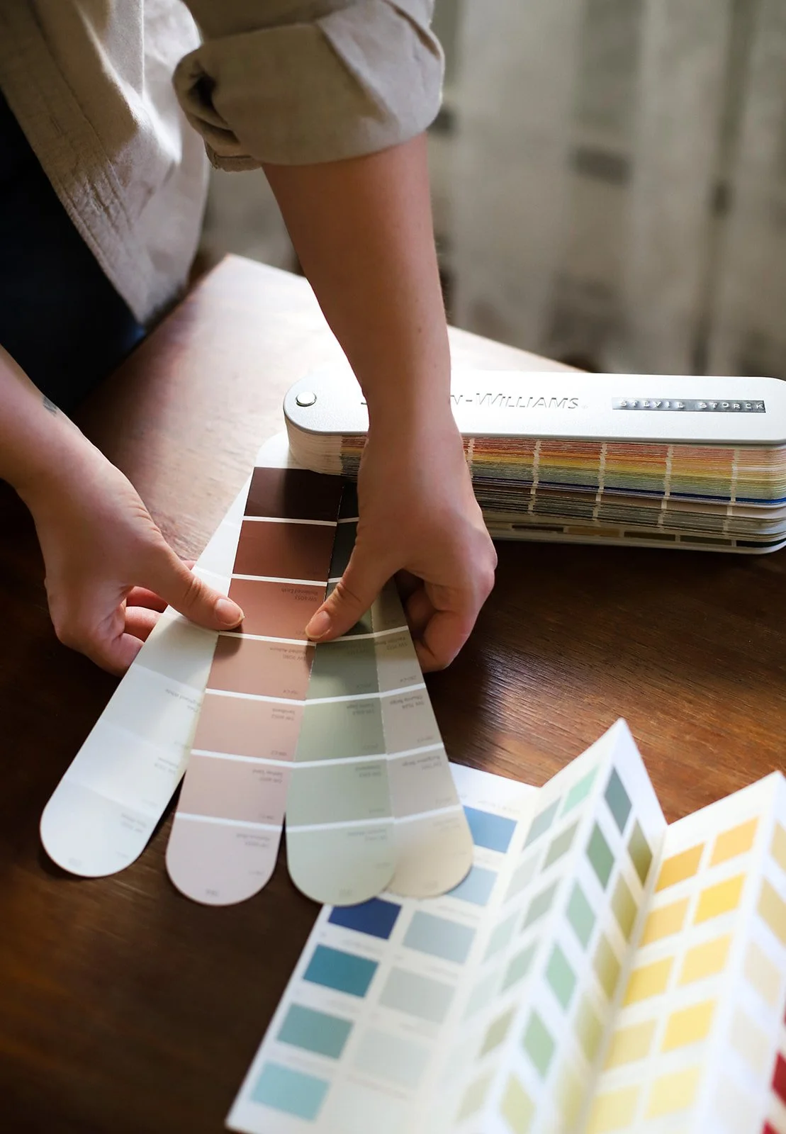
To track down colors that are beautiful, timeless, and easy on the eyes, try this.
A beautiful color on the chip can easily look extra bright on the wall once it’s against more permanent finishes in the room, which are usually a bit more neutral and organic, like wood, wall to wall carpet, countertops, etc. I prefer to live with wall colors that are either very neutral or very toned down, earthy version of colors. A simple hack for finding colors that are a bit more subdued is to look in the paint brands historic collection. Before the 1940’s, paints were colored with natural pigments sourced from rocks and plants. Farrow & Ball is a modern brand that utilizes natural mineral pigments in their range of stunning paint colors. Their product is high quality and pricey. If you’re on a budget, you can have their colors matched at another paint store. Synthetic pigments won’t have the same depth and finish, but their curated colors are a good jumping off point regardless. Benjamin Moore and Sherwin Williams both have historic color collections that I’ve utilized frequently.
My thoughts on sheen & durability
The old standard has been eggshell/satin on walls, semi-gloss on trim & cabinets, flat on ceilings. Most premium paint brands have now formulated washable, scrubbable finishes all the way down to flat. So if you are able to budget for a high quality paint, sheen is more of a personal preference and aesthetic choice now.
I personally enjoy a matte or velvet finish on walls (which fall between flat and satin in sheen level), and either a satin or semi-gloss on trim. In rooms where I am painting walls and trim the same color, I tend to use the same paint on both. It may be slightly preferable to have the trim done in a semi-gloss finish, but it saves both time and money (the cost of buying a separate gallon of paint for the the trim) to do them the same. And at this stage in my life, I am okay with making that trade off.
Paint can always be touched up. Your paint job will not last forever anyway; 5-10 years is a realistic lifetime for interior paint finishes. You may find yourself repainting sooner than that if you have kids and/or pets. So take the pressure off! Buy a reasonably high quality paint, do your prep work and you can absolutely achieve beautiful, long lasting results doing your interior painting yourself!