Reader Design Dilemma #1: Savannah's Philadelphia Master Bedroom
Today, I'm kicking off my new series with a Design Dilemma from friend and reader, Savannah Smith! Savannah loves classic Southern style with rustic elements and wants the suburban Philadelphia apartment she shares with boyfriend, Kyle to feel like a relaxed but put-together retreat.
Here's what Savannah had to say about their master bedroom:
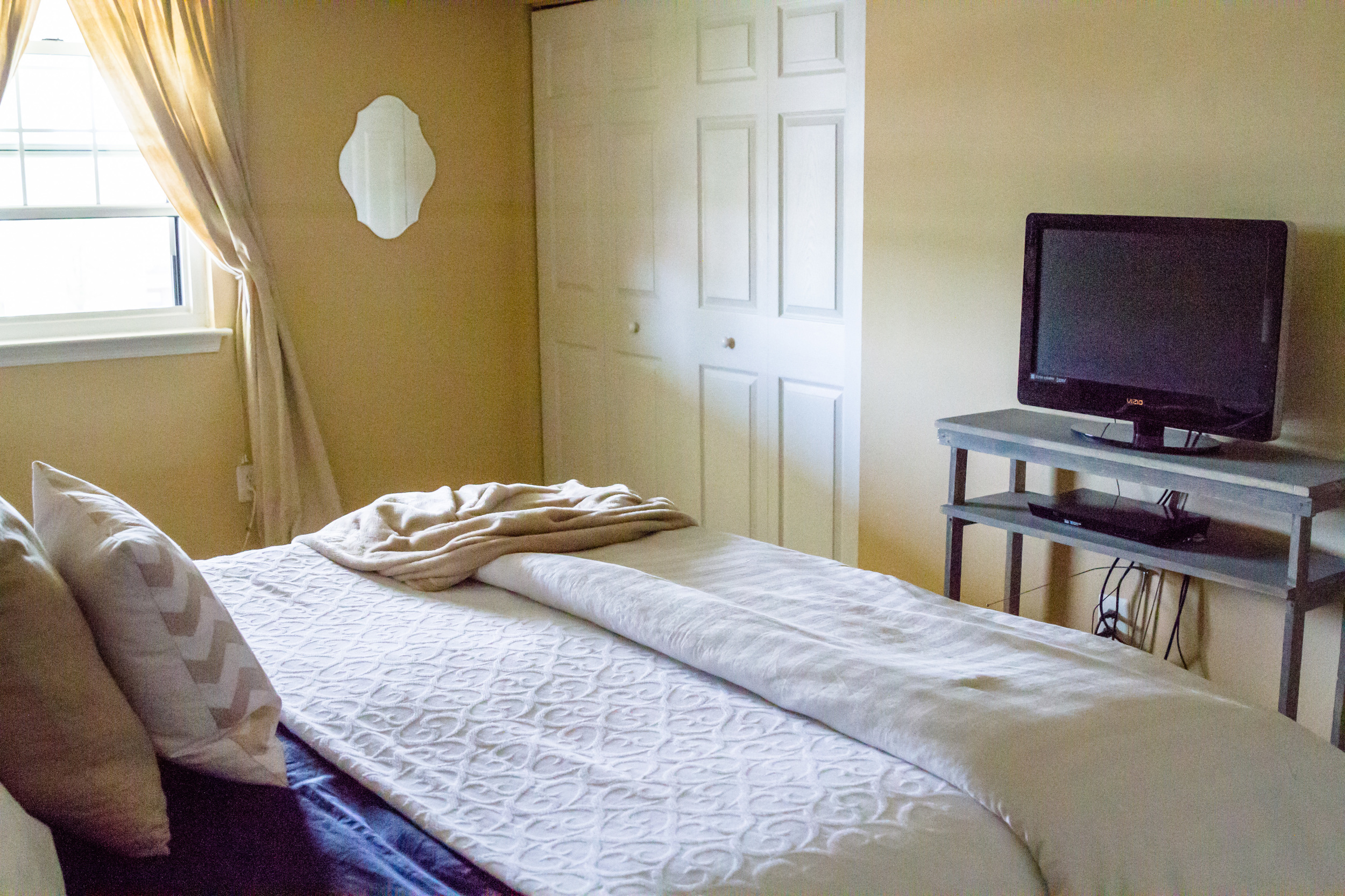
...We recently got a new and larger mattress and bed. I LOVE IT. However, the room just feels really unfinished. We'll probably be moving in a year or so and we currently rent. So i'm not looking to invest a lot in something that just won't transition into a new home (like paint, fabric wall coverings, etc.). I'm also limited in that the carpet must stay. The dresser is necessary for holding 50% of my clothes and I FINALLY got around to staining the custom built TV stand. I love this room but it generally feels very unfinished to me. I want it to be a comfortable but classy retreat.
Way to go on the new bed, Savannah! I am also a lifelong devotee of button tufting. I just love the classic, elegant feel that it lends to a room! You are well on your way to creating the classic, Southern retreat you are after.
After looking at your photos, I think the reason your room feels unfinished can be boiled down to two things:
1. An imbalance of scale
2. An imbalance of light, medium and dark tones.
King size beds are so luxurious, and with the extra tall headboard, it certain has a commanding presence in your room! While I'm sure your adorable nightstands looked great with your previous bed, they are a little too small to stand up to your new statement headboard. To balance the height and width of the new bed, I suggest you scale up both the size and visual weight of these pieces. Adding some framed art (or some of your photography!) and some taller lamps will help to fill the negative space above the nightstands and "marry" them visually to the bed.
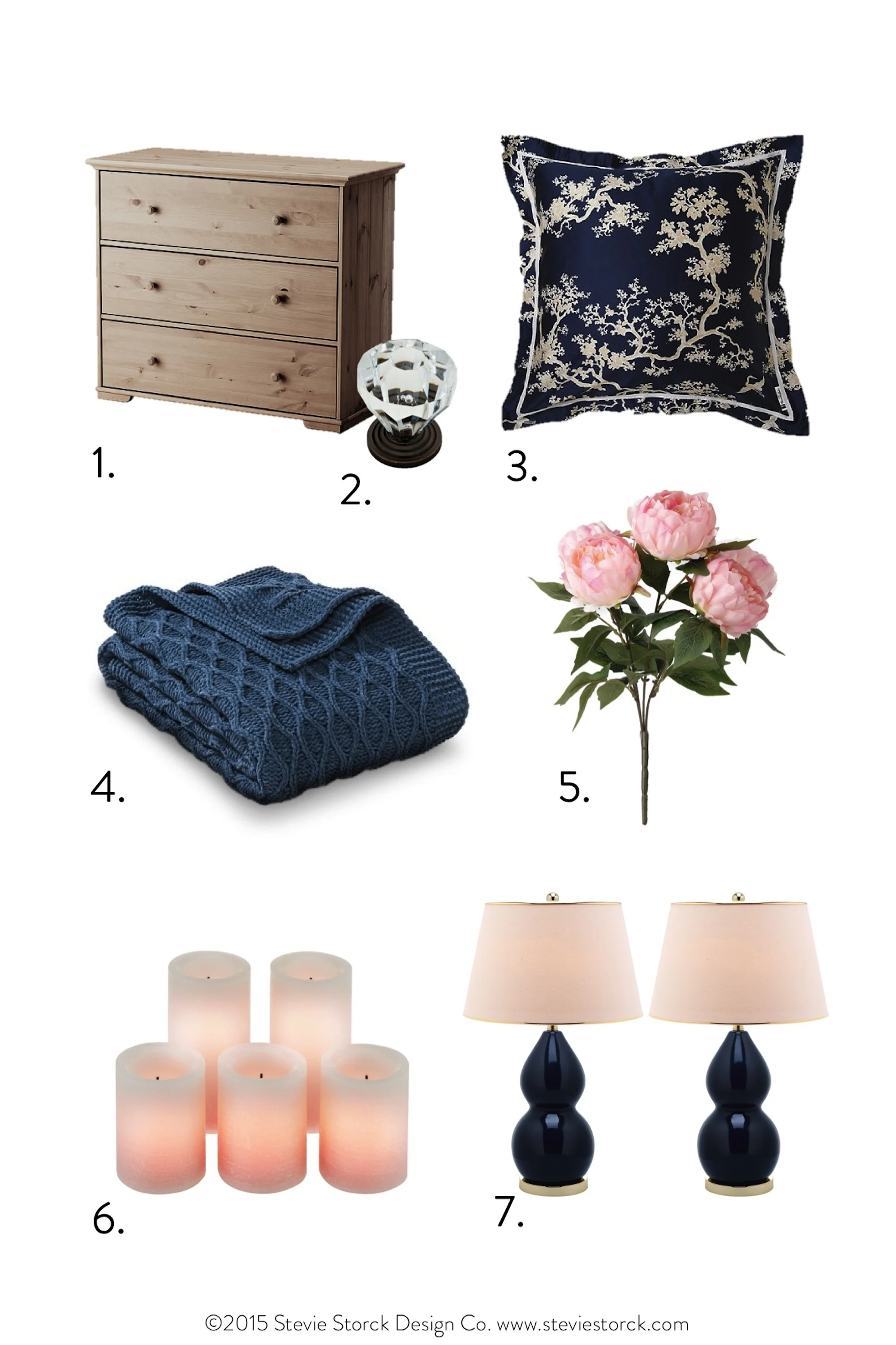
I know you are going for a light and bright feel for this room, but since your walls are light and your two biggest pieces (the bed and the dresser) are white, I think you need to bring in some more contrast with medium and dark tones to balance it out. My suggestion is to get these inexpensive chests from IKEA to use as nightstands. You could stain them the same color that you used on your TV stand and switch out the hardware to something with a more vintage look like these knobs. I like the direction you are going with adding navy, but I would swap the navy sheets for white and bring in navy lamps, similar to these ones. If those are too pricey, keep your eye out for lamps with a similar scale and shape on the clearance racks and at second-hand stores. With a little spray paint, they will fit the bill perfectly! To add some color and pattern to your bedding, I suggest getting 3 of these GORGEOUS euro shams . The crane design might be a British interpretation of a Japanese motif, but the look is very Southern chic. To finish it off, I would drape a nice denim hued throw over the foot of the bed. The slight shade variation will add some depth to the color scheme. I know you don't like anything too bold, but for just a little pop in the room, I would bring in some blush pink in the form of some silk peonies, and pillar candles.


